![[Previous]](image-lib/prev.gif) |
![[Contents]](image-lib/contents.gif) |
![[Index]](image-lib/keyword_index.gif) |
![[Next]](image-lib/next.gif) |
|
|
|
|
A container that can arrange its children in rows and columns
PtWidget --> PtBasic --> PtContainer --> PtGroup
For more information, see the diagram of the widget hierarchy.
None - use PhAB's Group Together button in the speedbar:

<photon/PtGroup.h>
The PtGroup class inherits the functionality of a container and actively manages the geometry of its children: the children are arranged in rows, columns, or a matrix, and PtGroup may give them exclusive-selection behavior.
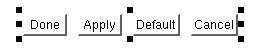
A group of buttons.
PhAB has a Group command that creates a PtGroup widget. See "Aligning widgets using groups" in the Geometry Management chapter of the Programmer's Guide.
| Resource | C type | Pt type | Default |
|---|---|---|---|
| Pt_ARG_GROUP_FLAGS | unsigned long | Flag | 0 |
| Pt_ARG_GROUP_HORZ_ALIGN | unsigned short | Scalar | Pt_GROUP_HORZ_CENTER |
| Pt_ARG_GROUP_ORIENTATION | unsigned short | Scalar | Pt_GROUP_HORIZONTAL |
| Pt_ARG_GROUP_ROWS_COLS | unsigned short | Scalar | 0 |
| Pt_ARG_GROUP_SPACING | unsigned short | Scalar | 0 |
| Pt_ARG_GROUP_SPACING_X | unsigned short | Scalar | 0 |
| Pt_ARG_GROUP_SPACING_Y | unsigned short | Scalar | 0 |
| Pt_ARG_GROUP_VERT_ALIGN | unsigned short | Scalar | Pt_GROUP_VERT_CENTER |
| C type | Pt type | Default |
|---|---|---|
| unsigned long | Flag | 0 |
Possible values:
The default setting of this resource is 0; that is, no flags have been set.
 |
Don't set the Pt_GROUP_EQUAL_SIZE_... and Pt_GROUP_STRETCH_... flags for the same direction - the group will expand every time its extent is calculated. |
| C type | Pt type | Default |
|---|---|---|
| unsigned short | Scalar | Pt_GROUP_HORZ_CENTER |
Determines how the children are aligned within the group. The children retain their relative positions to each other. Possible values:
| C type | Pt type | Default |
|---|---|---|
| unsigned short | Scalar | Pt_GROUP_HORIZONTAL |
Possible values:
| C type | Pt type | Default |
|---|---|---|
| unsigned short | Scalar | 0 |
For a horizontally aligned group, this resource indicates the number of columns to distribute children into. For a vertically aligned group, this resource indicates the number of rows to distribute children into. Not used for an "as is" group; see Pt_ARG_GROUP_ORIENTATION, above.
| C type | Pt type | Default |
|---|---|---|
| unsigned short | Scalar | 0 |
If alignment is in effect, this resource defines how many pixels will separate each child of the group.
|
If you set this resource, you'll automatically set Pt_ARG_GROUP_SPACING_X and Pt_ARG_GROUP_SPACING_Y to the same value. |
| C type | Pt type | Default |
|---|---|---|
| unsigned short | Scalar | 0 |
If alignment is in effect, this resource defines how many pixels will separate each child of the group horizontally.
| C type | Pt type | Default |
|---|---|---|
| unsigned short | Scalar | 0 |
If alignment is in effect, this resource defines how many pixels will separate each child of the group vertically.
| C type | Pt type | Default |
|---|---|---|
| unsigned short | Scalar | Pt_GROUP_VERT_CENTER |
Determines how the children are aligned within the group. The children retain their relative positions to each other. Possible values:
If the widget modifies an inherited resource, the "Default override" column indicates the new value. This modification affects any subclasses of the widget.
|
|
|
|